Hold your own cluster picture up against these before you hand it in. Ask one question: does mine show separated, colored, labeled groups, or one undifferentiated blob. Each row is the same chart two ways: the static picture on the left, and a live Apache ECharts version on the right that you can hover for a point's values and toggle by clicking the legend. All of it comes from the same Lab 10 data, so the differences come from choices in the build: the scaling, the colors, and the labels.
Static chart
Interactive chart — hover a point, click the legend to toggle
Interactive — hover a point
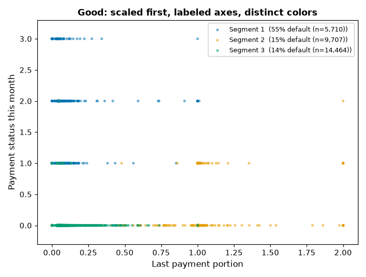
Good. The features were scaled before clustering, the
axes are labeled, and the three segments sit in mostly separate regions with colors that do not
imply an order. The legend carries each segment's default rate, which is what lets the chart
support the verify step instead of just decorating it. Hover the live version to read any point,
and click a segment in the legend to isolate it.
Interactive — hover a point
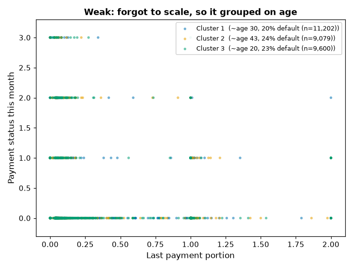
Weak, unscaled. No scaling, so k-means grouped on the
widest-range column, age, instead of on behavior. On the behavior axes the colors overlap, and
all three groups default within a few points of the base rate, so the split found almost nothing
a reviewer could act on. Hover the live version and you can see the three colors sitting on top of
each other.
Interactive — hover a point
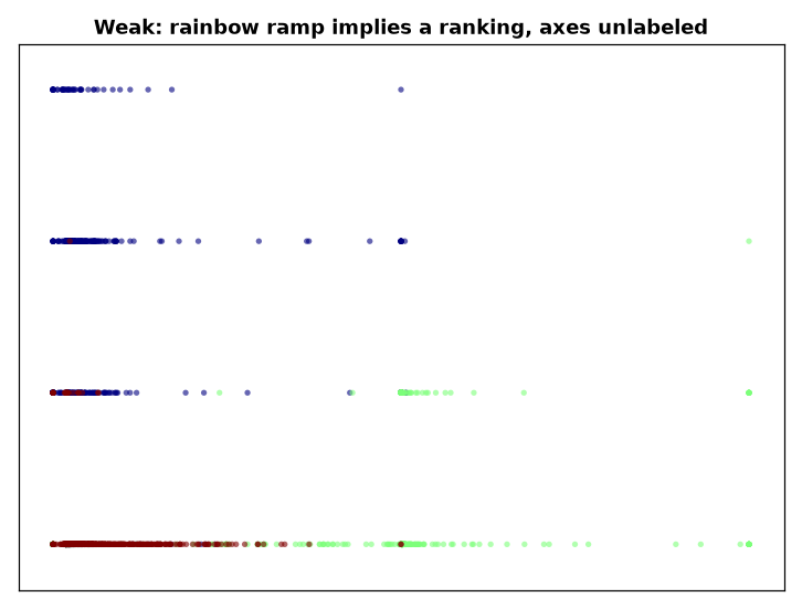
Weak, misleading. The same good clustering as the top
row, presented badly. The rainbow ramp reads as a ranking the segments do not carry, and the axes
are unlabeled, so a reader cannot tell what the chart is claiming. The live version is just as
interactive and just as unreadable until you hover, which is the point: interactivity does not fix
missing labels.
Back to the Lab 10 page, or the
Week 10 page.